Across the UK, more people are browsing the web on their phones than on desktops. For businesses, this shift means that having a website designed only for larger screens is no longer enough. Customers expect smooth, reliable experiences no matter what device they use.
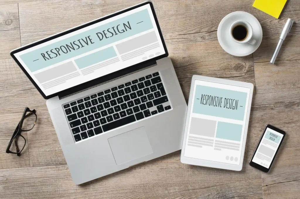
This is where responsive WordPress websites make the difference. A responsive design make sure your site automatically adapts to different screen sizes, mobile, tablet, or desktop, while still looking professional and easy to use.
Working with professionals to build a responsive site also means your website supports business goals consistently, from improving customer trust to driving conversions. Yet, many UK businesses still overlook this critical element, and as a result, lose customers before they even engage.
The Changing Online Behaviour of UK Customers
Online behaviour in the UK has changed rapidly over the past decade. Mobile browsing now dominates, while desktop use continues to decline. For most customers, their first interaction with a business happens through a smartphone, often while they’re on the move.
With this shift, expectations have also grown. Customers want fast-loading websites that work seamlessly across all devices. A site that looks fine on a desktop but breaks or feels slow on a mobile screen can quickly turn visitors away.
This is where custom WordPress themes become valuable. They provide the design flexibility needed to adapt layouts, images, and content for different screen sizes without losing consistency or professionalism.
Without responsive design, businesses risk losing visitors in seconds, often before they have a chance to explore products or services.
What Responsive WordPress Design Really Means
Responsive WordPress design means building one website that adapts smoothly to any screen size, whether it’s a mobile phone, tablet, or desktop. Instead of creating separate versions for different devices, a responsive site adjusts its layout and features automatically.
The key elements include fluid grids that resize content, flexible images that fit different screens, and scalable typography that stays readable without zooming. Together, these make sure a site looks professional and functions properly no matter how customers access it.
For businesses, the benefits are clear. A responsive design strengthens brand identity by keeping the look and feel consistent across devices. It also makes navigation easier, creating a smoother experience that encourages customers to stay longer and engage more. Higher accessibility means the site is usable for all audiences, including those relying on mobile-first browsing.
Without responsiveness, businesses risk creating frustration, lowering trust, and pushing potential customers toward competitors who provide a smoother experience.
The Risks of Ignoring Responsive Design
For UK businesses, overlooking responsive design comes with serious consequences. One of the biggest risks is high bounce rates on mobile devices. If customers land on a website that doesn’t display properly, they’re likely to leave within seconds.
Poor navigation or broken layouts can also lead to lost conversions. A visitor who struggles to find information, book a service, or make a purchase will often turn to a competitor’s site instead.
There’s also the issue of visibility. Google now prioritises mobile-friendly websites in its rankings, meaning a non-responsive design can harm SEO performance and reduce traffic.
These risks directly affect growth, reputation, and profitability. The good news is that investing in responsive WordPress design helps protect your business from these challenges while creating a stronger customer experience.
Benefits for UK Businesses
For UK businesses, a responsive WordPress design offers clear advantages. First, it builds stronger trust with customers by ensuring the site looks professional and works smoothly on any device. This reliability encourages visitors to stay longer and engage more with your services.
A responsive site also provides a competitive edge in industries where digital presence is crowded. When many competitors still struggle with outdated or desktop-only designs, a mobile-friendly website sets your brand apart.
Flexibility is another benefit. As your business grows, a responsive site adapts easily to new services, features, or markets without the need for a full redesign.
Responsiveness also connects closely to usability. As discussed in our blog on UX & UI design, a well-structured, user-friendly website keeps customers engaged and makes their experience seamless.
The right design not only strengthens customer relationships but also directly impacts visibility and long-term growth.
SEO & Performance Advantages of Responsive Design
Mobile-first indexing in Google
Google now prioritises mobile-friendly websites in its rankings. A responsive WordPress site ensures your business is visible to UK customers searching on mobile devices.
Faster load times for better user experience
Responsive websites are designed with performance in mind, reducing unnecessary code and improving page speed. Faster sites lead to lower bounce rates and stronger engagement.
Improved SEO and higher rankings
Clean, responsive code supports structured site architecture, making it easier for search engines to crawl and rank your content.
Personalised for UK SEO needs
A responsive design ensures your site meets local search requirements, from compliance with accessibility standards to better optimisation for regional keywords.
Link with performance optimisation
As explored in our blog on WordPress performance optimisation, site speed and responsiveness go hand in hand for achieving top results.
A responsive website is not just about looking good, it drives measurable outcomes like better rankings, higher conversions, and long-term visibility.
The Long-Term Value of Responsive Websites
Investing in a responsive website offers lasting value for UK businesses. Instead of redesigning your website every few years, a responsive design makes sures your site adapts as technology and customer habits evolve. This makes it more cost-effective in the long run.
Responsive websites are also future proof, meaning they adjust seamlessly to new devices and screen sizes as they appear. When built with strong development practices, they provide added benefits such as better security, easier scalability, and fewer ongoing issues.
This long-term perspective shows why professional support and expertise are essential to maximise results and protect your investment.
Why Work with Professionals for Responsive WordPress Design
Creating a responsive WordPress website involves more than just making it look good on different devices. Professional developers understand how to align responsiveness with your specific business goals. This means every design choice, whether layout, navigation, or content presentation, is planned to support growth, conversions, and customer engagement.
Working with experts also ensures smooth integration with your existing branding, plugins, and custom themes. A professional team knows how to avoid compatibility issues that can slow down performance or damage user experience. Beyond the initial build, ongoing support and updates are critical. Professionals can keep your site optimised, secure, and ready to adapt as both your business and technology change.
For businesses in the UK, where digital competition is strong, investing in professional responsive WordPress design is not just an option, it has become a standard that every business must meet to remain visible and competitive.
Final Thoughts
Responsive WordPress design is no longer a nice-to-have, it’s a critical part of building trust with customers, improving performance, and supporting long-term business growth. From delivering a seamless experience across devices to strengthening SEO and scalability, responsiveness directly impacts how users interact with your brand online.
If your website is not yet responsive, now is the time to act. Businesses that adapt to modern expectations gain stronger engagement, better visibility, and a lasting competitive edge. Exploring responsive WordPress design ensures your site is prepared to meet customer needs today and in the future.
Request a consultation today and see how responsive design can improve your customer experience.